How do specialists in different disciplines make explicit use of “thinking and mind” in their work? We’re pleased to invite guest writer Brian Jens, a design professional, to offer insight from his experience on one key element of his work.
___________________________________________________________________________________
Have you ever wondered why you prefer this or that color?
 Color plays an important role in human life: it can affect decision making, change your reaction, or be the cause of it. Under the influence of a particular color, you may experience a change in pressure and appetite. We do not generally focus the attention on color in everyday life, so the importance of understanding its effects comes to us only when the color is absent: for example, on a cloudy or rainy day we may feel depressed, and the world around us seems to be unfriendly.
Color awakens unconscious reactions that may vary depending on our individual personal characteristics. The color that we prefer and respond to can tell us a lot about ourselves, namely about our concerns, fears, aspirations, and so on.
The greatest problem in our industry is the fine line between all the scientific research and the reality. Despite all the progress in the study of color and its impact on a person, it is still not possible to find a clear correspondence between them. Therefore, the piece below is the belief of our DesignContest team, which is based on personal experience and partly supported by independent studies and known facts. We do not pretend to know the truth – we just hope that our observations will help you in this or that way, when it comes to using colour in practice.
The Perception of Color
On the one hand, the perception of color is dependent on the physiological characteristics of an eye, nervous system, experience and the environment. On the other hand, we know that color is radiation of different wavelengths characterized by different degrees of reflection, refraction, and absorption. The eye perceives color, and then the brain starts to process it.
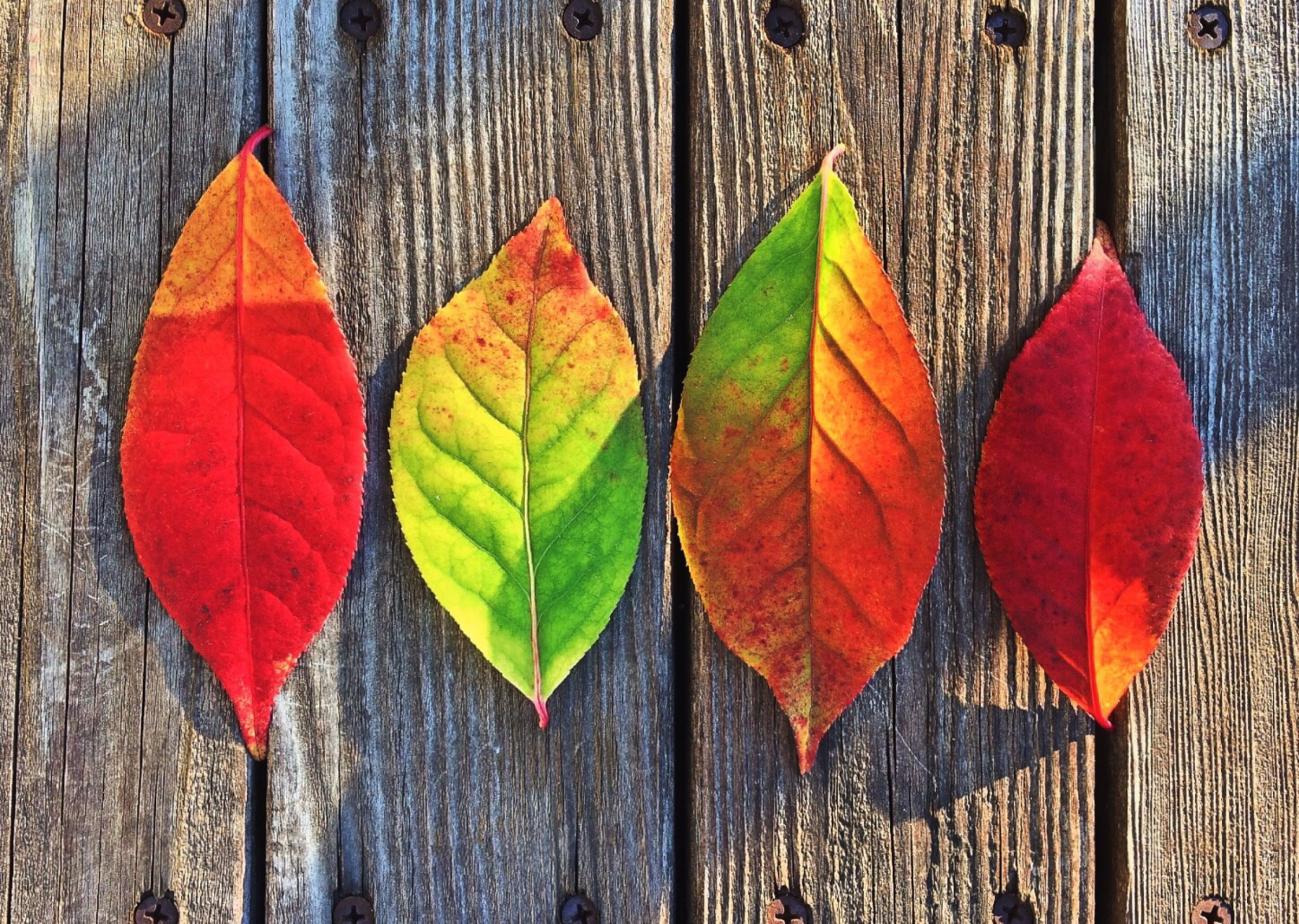
For example, the so-called “hot” colors – red, orange and yellow – have the greatest wavelength and require a considerable amount of energy to be perceived. These colors stimulate the brain, increase heart rate and breathing. On the contrary the “cold” green and blue colors have short waves and are therefore easily perceived. These colours have a calm and relaxing effect.
The personal experience of the individual also plays an important role in the perception of color. Each color gives a specific signal to our subconscious and awakens a reciprocal emotion. Under the influence of different colors, we feel and think differently.
Color psychology can, for example, be used to create a comfortable environment for negotiations, or increasing the productivity of employees and the activity of buyers. It is also important in interior decoration, having an effect on our domestic and working spaces.
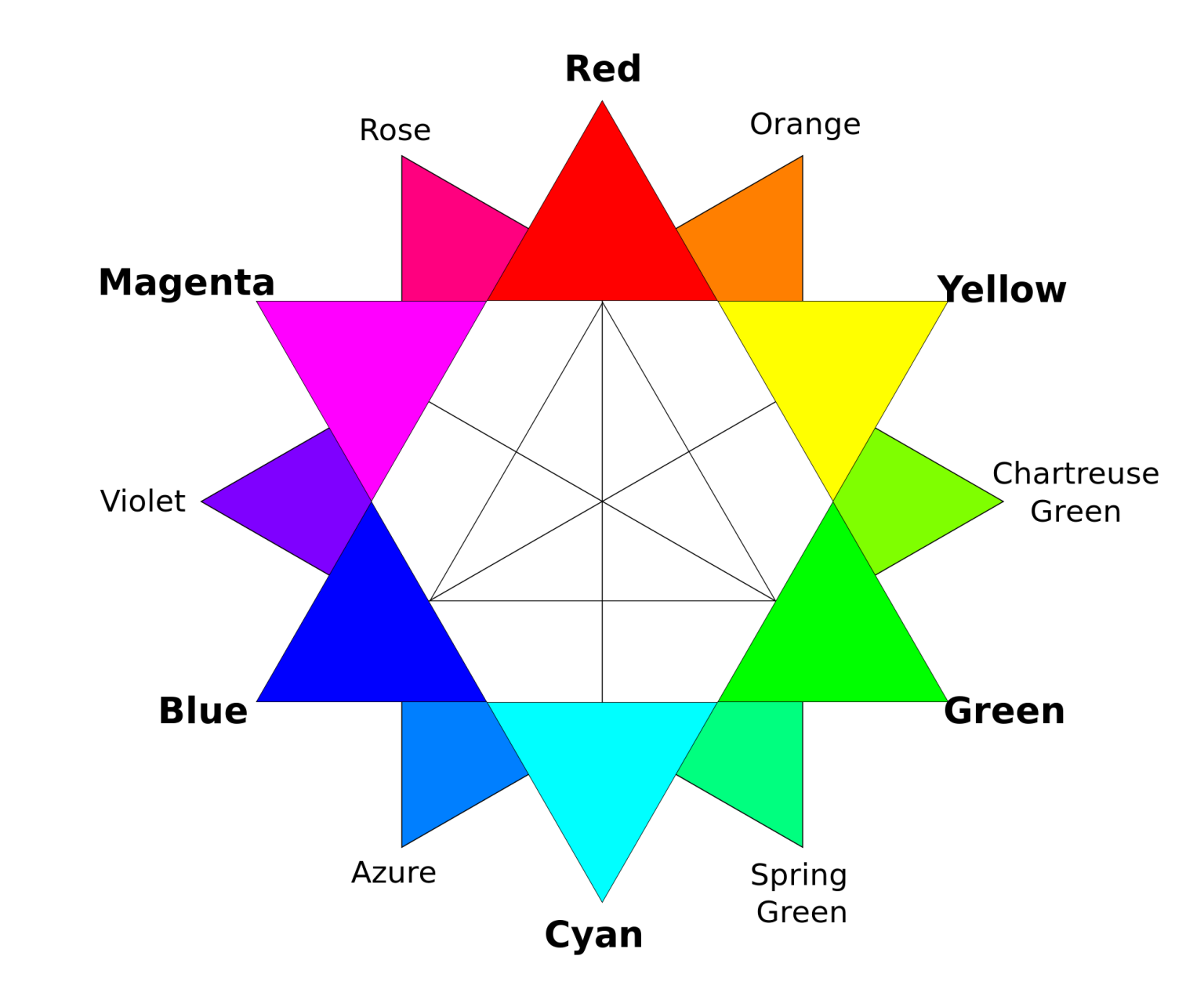
We can recognize about 1.5 million shades. What’s more, we do not just see color – we feel it. According to psychologists, 80% of color is absorbed by the nervous system and only 20% by vision.
Stimulating Effects of Color
The atmosphere in an interior largely depends on the kind of color chosen.
- Warm colors (shades of red, orange and yellow) bring energy and stimulate, so they are often used to “warm up” buyers in the store and increase efficiency in the office.
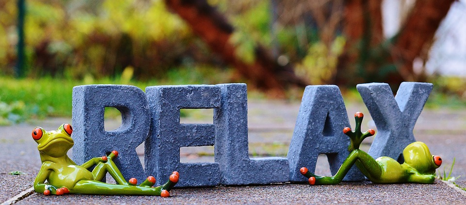
- Under the influence of cold colors (shades of blue, blue and purple), the activity of people is markedly reduced, their movements slow down, they feel relaxed.
Red is the strongest color in the warm palette. It speeds up breathing, tenses muscles, quickens heartbeat. Red accents in interior design stimulate buyers and increase unplanned purchases. Red also improves digestion, so it’s ideal for cafes and restaurants. Be careful using red, however, because it quickly causes us to tire and provokes aggression.
Orange causes a burst of energy and improves appetite. It best works as an accent color. In over-abundance it is annoying; meanwhile, the combination of orange with blue shades gives a sense of looseness and freedom: this gamut is suitable for sports shops. Pastel shades of orange are associated with health, beauty, golden tans and the rest, so they are often used in the design of women’s shops and beauty salons.
Yellow is one of the most catching colors. It stimulates the eyes and causes a cheerful mood. Yellow is good to attract attention. It can be used for the announcement of special offers. Also, text set on a yellow background is most convenient for perception. Bright and warm colors attract people of moderate means; a combination of yellow and red is always connected with reasonable prices.
Relaxing Effects of Color
Cool colors (light blue, blue and purple) create a relaxing atmosphere: buyers spend more time choosing, they’re less worried about costs. Using the cold range of colors is justified in expensive stores and where queues can occur.
Light blue evokes a feeling of well-being. It’s associated with persistence. Light blue promotes trust and absorption of information. The beneficial effect of this color can be used in the design of meeting rooms. As for the office space, light blue works best in combination with yellow, increasing concentration and activating the brain.
On the contrary, blue is not suitable for a production environment. It dissipates the attention, reduces efficiency and visual acuity. Blue is the best solution for restrooms. It’s not recommended for the interior of cafes since it reduces appetite while making the space seem empty and cold.
Rich shades of purple also reduce activity, suppress appetite, and are more suitable for meditation than for business. A combination of purple and orange leads to sad thoughts about the impermanence of life. For most shops and offices, designing the space with bright colors is a win-win option. Light colors enlarge the space and highlight details, so they are good if you want to focus attention on the products.
As you can see, colour significantly affects a person’s subconscious, and, consequently, their decision-making, so we can make use of its effects for business purposes. The competent use of color, however, is only a small part of what is necessary for a company’s success in a competitive market. The choice of color is important – but only if the product you paint it with is also high quality.
Brian Jens – Guest Contributor
___________________________________________________________________________________
About Brian
Brian Jens works at DesignContest – a logo design platform for the battle between the top designers in the world, based in the U.S.A. Apart from his design engagement, Brian conducts research on the most palpitating topics. If you have some idea to offer, please do, and most likely you’ll get the topic covered soon.
Favourite quotation: “The purest and most thoughtful minds are those which most love colour.” John Ruskin